

Tuesday, 25 January 2011
Monday, 24 January 2011

Friday, 12 March 2010
Products
Tshirt


The first product is a t-shirt which might look something like this. The t-shirts will be available in various colours and have different character designs on the front and the logo on the back. These will cost £10
Key Rings


The final family of products we have designed are two key rings and two fridge magnets. One pair has this design, and might look something like this which is available in a key ring and a fridge magnet, and the other set has this design , which is also available in both, and each of these small momentums will cost £3.
Tea Set


Next we have a tea set, which includes all the typical items of a tea set, cups, saucers spoons, milk jug, sugar bowl and tea pot. They are all held in a blue box. There is one design for the set as a whole, and each item of the set has a smaller modified design on it. This will cost £10.
Stationary Set

Similarly, we have a stationary kit. Including the items you can see here The pencil case has one of the designs on the front of it, and the other stationary also has various designs and typography on as you can see here. And this as a set will cost £5
Hoodie

The hoodie will cost £15, also available in a range of colours and with different character designs.
Wood Block
**ADD**
All of these products will be available in the YSP gift shop, and there will be a special stand at our event. They are also to be sold on both Etsy and EBay accounts created by our group.
Sketchbook Cover
Scanned in Sketch

Sketchbook Design with filter

Digital Sketchbook Design

Design on Sketchbook

The design follows an out of space theme, which includes our character and logo. This is to represent exploration and travel and coming to an alien environment, we thought this would relate to our target audience, of students travelling to the UK for the first time and feeling like they are in an alien environment.
Point of Sale

Press Release

FOR IMMEDIATE RELEASE
Contact: Hayley Lumley
Mobile: 07718998977
Email: hayley_2k5@hotmail.com
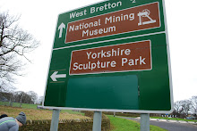
YORKSHIRE SCULPTURE PARK: OPENING THE DOORS
TO A WORLD OF CULTURE, ART AND FOODS!
The Yorkshire Sculpture Park in Partnership with YSP for International Students
To Hold Cultural Food and Craft Fair to Welcome Exchange Students
The event has been set up for students beginning the new term to welcome them to the UK and help begin their studies. University Foreign exchange offices across the country have been notified and will pass on the invitation to travelling students for this one off cultural experience, which will coincide with World Peace day, 21st September 2010.
Lasting from 11am to 5pm, a continental food and crafts market will be held outside the main indoor gallery. Local food and craft traders who run similar markets in the Yorkshire area will set be selling their products. The Visitors will have the chance to browse the market whilst exploring the sculptures, all set in the scenic West Yorkshire countryside.
The event dedicated to foreign exchange students however all students are welcome and the park will be open to the general public as usual. The event is an opportunity to meet other people and bond over mutual interests in art and different cultures. The event is free of charge excepting parking expenses.
The reason for holding this event is to launch the new friendship program ‘YSP for International Students’, which is to encourage foreign students to visit the park during their stay. The program will help Students bond with each other as well as providing a memorable day to experience the world of sculpture.
Blog Entry: Writing the press release
The job of writing the press release had come to me so I planned to do so properly. Tutors advised me that they should be straightforward, without fussing around the point. I was told to look at templates online and so I did. This website which I came across was full of useful advice and really helped me with the process of writing the press release.
Digital Designs


To show a clearer more detailed of our concept ideas, uploading the original design ideas and created digitalized images in illustrator. Once digitalized colour theory became more apparent as with keeping in the natural palette of blue and green; whilst generating a fun friendly feel. The composition of the shapes within the designs help convey the mixture hard and soft allocating for the design to be focused more around shape then colour. All the characters have a relationship with the products based upon colour schemes and relevance. Almost iconic the characters bring a whole subtlety to design. The digitalized images portray the message of friendship, as they are cool fun and inviting with the subtle colouring and unusual shapes. Due to the unusual aspects the images are warming. People can relate to the simplicity and style of production. Through the digital process we have gained a clearer insight to what products would compose of and how they would appear to the market.
Thursday, 4 March 2010
Design production meeting
Design production meeting
Designs


Today Dot and I met up in the library and had a long meeting about our design proposals. After being left in charge of the design side of the production we had both previously gone off and done some sketches of ideas. What Dot came back with was some monster illustrations and typography, she said that she was inspired by this particular illustrator that she knows personally.
http://mon53.co.uk/new%20site%20gallery.html
The work is also inspired by contempory illustrator BeaucoupZero, whose profile I found on Deviant Art
The whole group were quite impressed and so we have adopted this theme to run throughout out project.
This brought us to our meeting where we sat down for a few hours and discussed our ideas for the product designs and also the sketchbook covers. These three illustrations will form the basis of our product designs, we discussed ways to verify them and how to show them on each of our products (T-Shirt/Hoodie, Tea Set, Stationary Set, Key ring/Fridge magnet and typography blocks) During our next meeting we plan to discuss these ideas with the rest of our team, and as long as everyone is happy, we will pass along the idea and design to Jacqui, who can complete them using Photoshop and Illustratos.
Our target audience of international students inspires the typography included in the designs. As we want our products to appeal to as many of them as possible, we have selected various languages to place across the designs using one particular word. As a group we decided on ‘Welcome’, however after some deliberations we decided that this may not look right on particular products, such as a tea set. From this, we have decided to use the word ‘Hello’ instead as this is pretty basic, and universal as a greeting.
We also discussed ways in which we can present the product proposals in our upcoming presentation. As we do not have financial means of producing mock ups, we decided that an effective way to show off the design of each product would be with an A2 mood board dedicated to each of them, with this we can show the shape of the product and how are designs would be shown on them. We would also mention some important considerations that would need to be made when proposing a product, such as cost, packaging, production etc. Below are some of my (Hayley) rough sketches of the product proposal mood boards.
Products – Tshirt/Hoodie

For the T-Shirt and hoodie, we have chosen to use ‘Dots Design 1’ which, when completed should hold all of the typography surrounding the central image. The T-Shirt will be white, with the image in the centre on the front, and on the back will be our team logo. The hoodie will be the same but instead of white it will be another colour that is yet to be decided.
Products – Tea Set

For the Tea Set, which includes two cups, spoons and saucers, and one milk jug and a sugar bowl, We have chosen a tin box to keep it in. The tin box will be a pale blue to match ‘Dots Design 2’ When on display the lid will be on the bottom of the box, revealing the contents to be sat in a foam bed and wrapped in cellophane to protect it. The design being used for this product will be split into three, one part being printed on the cups, another on the milk jug and another on the sugar bowl. The saucers will have the typography running around the edge of it, and so will the top of the other pots in the set.
Here are some images found on Google that have given us inspiration
http://z.about.com/d/collectibles/1/0/n/b/3/teaset.jpg
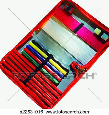
Products – Stationary Set

Housing the stationary set, ( Notebook, pen, pencil, ruler, sharpener, rubber) is a book like fabric case which zips open, when it is open, all the pieces will be held in with a piece of elastic. The notebook cover is Dots Design 3, and also the group logo, which will also be printed on the front of the case. Then pen, pencil, and ruler will have the typography on it, but instead of having every word repeated on all three, they will follow on from each other onto the next item. The sharpener and rubber will just be a simple matching colour as they will be too small to print something on.
Here are some images found on Google that we have found inspiration for our designs from
http://comps.fotosearch.com/comp/FSA/FSA153/close-up-open-pencil_~x22531016.jpg
http://bebereviews.typepad.com/.a/6a00d8341c3f0553ef0115722a2d84970b-400wi

This set of products will be basically the design, materialised into an object. The key ring will be about 10-12 cm long by 5-7 cm wide. It will be ‘Dots Design 1’ made from a form of rubber with the colours matching them from the T-shirt version. The fridge magnet will be made of plastic and will have ‘Dots Design 3’ printed on it and will be a similar size to the key ring.
Here are some images of products that we have found on google that have inspired our products
http://www.pacholdings.com.au/media/pics/site/imagecache/6E6D9912FA283DD277D02BD4A0444E47.jpg
http://s2.thisnext.com/media/230x230/Cute-Fafi-Keyring_61676C6D.jpg
After our discussion Dot and myself made a to do list for ourselves, they look something like this;
Dot
- Split ‘Dots Design 2’ into smaller designs for the purpose of the tea set
- Create typography for the word ‘Hello’ in our chosen languages to be placed onto the designs
- Give our designs and creative input to Jacqui to complete on photoshop
Hayley
- Create the design for the sketchbook cover with the use of ‘Dots design 1’ and our team logo, aswell as Jacqui’s help with photoshop.
- Create mood boards with product proposals on to show in our presentation.
- Hayley & Dot -
Subscribe to:
Posts (Atom)